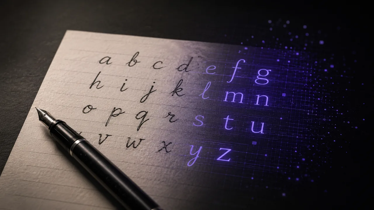
Your handwriting is one of a kind, so why not type with it? Turning your handwriting into a font is easier than most people expect, and with FontMaker you can do the whole thing for free, right in your browser. This guide walks you through it, from the first pen stroke to a real TTF or OTF file you can install and use anywhere.
What you need
You do not need any design skills or paid software. Here is the short list:
- A printed template with a box for each letter (a plain grid works too).
- A dark marker or felt-tip pen, not a thin ballpoint.
- White paper and a way to scan or photograph your page.
- A browser. FontMaker runs entirely on your device, so nothing is uploaded and nothing is installed.
High contrast is the secret. Dark shapes on a white background give the cleanest trace, because the dark areas become your letters and the white becomes transparent.
Step 1: Write your letters
Start from a printed template with a labelled box for every character. It keeps your letters the same size and sitting on the same line, which saves a lot of cleanup later.
A few habits make the tracing much cleaner:
- Use a dark marker, not a ballpoint. Thick, solid strokes trace far better than thin, patchy ones.
- Write one clean version of each letter. You do not need three tries, just your best single stroke.
- Stay inside the boxes and keep letters from touching each other.
- Aim for the full set you need: uppercase, lowercase, the digits 0 to 9, and a few punctuation marks like a period and a comma.
Write at a comfortable pace. Your natural rhythm is exactly what makes a handwriting font feel like you.
Step 2: Scan or photograph your letters
Now turn your paper into an image. A flatbed scanner is best: it gives you flat, evenly lit, high-contrast results with no shadows.
No scanner? A phone works well if you get the basics right:
- Lay the page flat on a table.
- Use bright, even light and avoid casting a shadow over the paper.
- Shoot straight down so the page is not skewed.
- Keep the contrast high so the ink reads as solid black.
Save your image as PNG or JPG. If you can, crop out anything around the page so only your letters remain.
Step 3: Import them into FontMaker
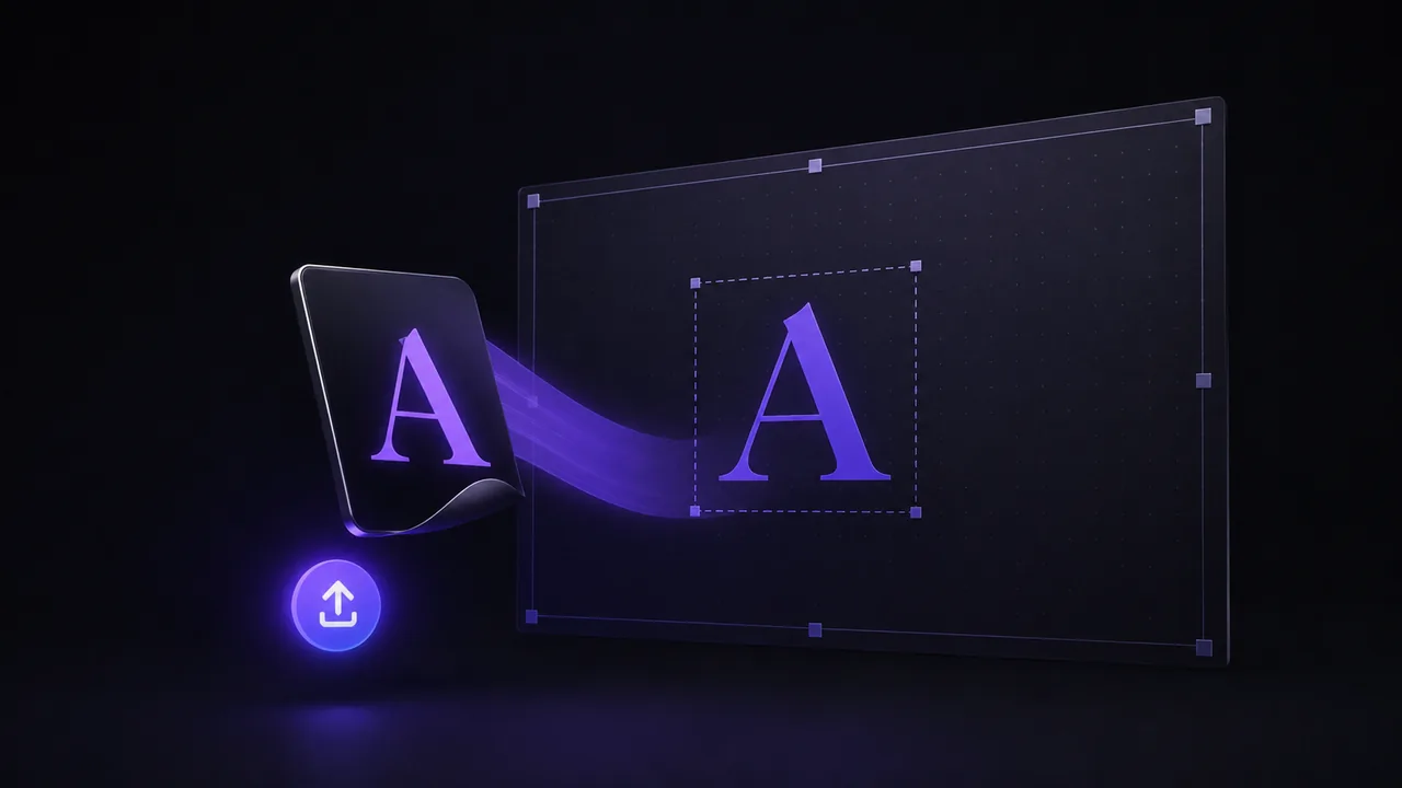
Open FontMaker and drag your images into the import area, or click to browse. It auto-traces your PNG and JPG scans into clean vector glyphs, so you do not need to redraw anything. It accepts SVG files directly too, and reads WebP and GIF.
You have two easy ways to map each shape to the right character:
- Drop your letters in and assign each glyph to its character in a couple of clicks.
- Or name each file after its letter (for example
a.png,B.png,comma.png). FontMaker reads the character from the file name automatically.
If a letter came out badly, you can retrace just that one or even draw a glyph directly in the app.
Step 4: Refine spacing and export
This is the step that makes a font feel finished. Type any text in the live preview and watch it render in your own hand. Then fine-tune:
- Baseline and size for each glyph, so tall and short letters line up.
- Left and right bearings (the space on each side), so words are not too tight or too loose.
Small, consistent tweaks here are what separate a rough scan from a font that looks intentional. The preview updates as you type, so you see every change immediately.
When you are happy, export. FontMaker gives you a real TTF or OTF file, the same formats professional foundries ship. Double-click it and choose Install on Windows or macOS, then use it in any app: Word, Google Docs, Canva, Photoshop, and more.
Tips for a natural handwriting font
A handwriting font should feel human, not perfect. A few ideas:
- Keep one style. Use the same pen, angle and speed for every letter so they feel like one family.
- Do not over-straighten. Slight wobble is what makes it read as handwriting.
- Add alternates. If your tool supports it, a second version of common letters breaks up repetition.
- Include a real space and punctuation, so full sentences look right.
- Test real words. Type names and sentences, not just single letters, to catch spacing problems.
That is the whole process: your handwriting on paper, turned into a font you can type with anywhere. The best way to understand it is to try it. Write a page, scan it, import, and export. In a few minutes you will be typing in your own hand.