Making your own font used to mean buying heavy desktop software and spending a weekend learning it. It does not anymore. With a browser-based tool like FontMaker, you can turn your own drawings or handwriting into a real, installable font in a few minutes, for free. This guide walks you through the whole process, step by step.
What you need
You do not need any design experience or paid software. All you need is:
- A set of letter shapes, as images (PNG, JPG) or SVG files, or your handwriting on paper.
- A browser. That is it. FontMaker runs entirely on your device, so nothing is uploaded and nothing is installed.
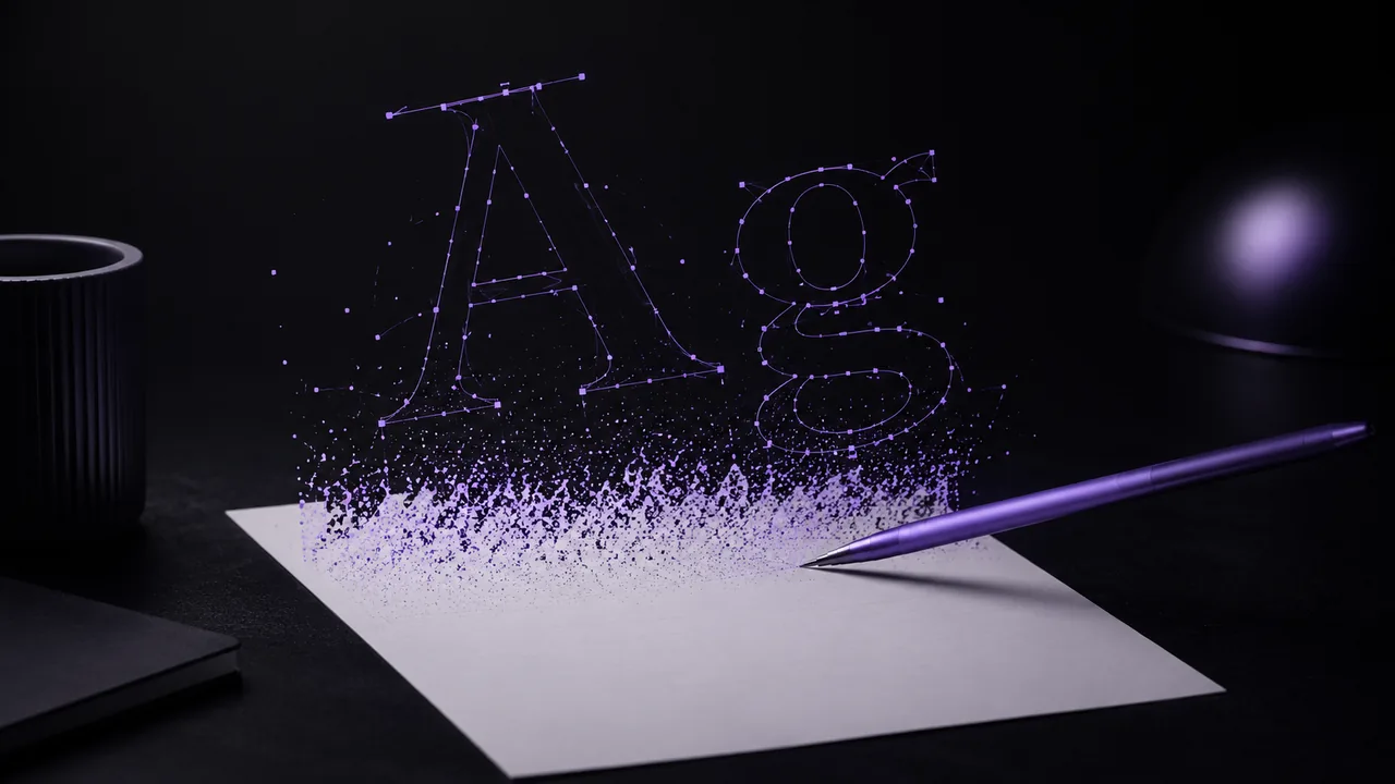
If you are starting from handwriting, write each letter clearly with a dark pen or marker on white paper. High contrast (dark shapes, white background) gives the cleanest result, because the dark areas become your letters and the white becomes transparent.
Step 1: Get your letters ready
Decide which characters you want in your font. For a usable font, aim for the full alphabet in the case you need (uppercase, lowercase, or both), the digits 0 to 9, and a few punctuation marks like a period and a comma.
Name your files after the character they represent when you can (for example A.svg or a.png). FontMaker reads the character from the file name automatically, which saves you from mapping every glyph by hand later.
Step 2: Import them into FontMaker
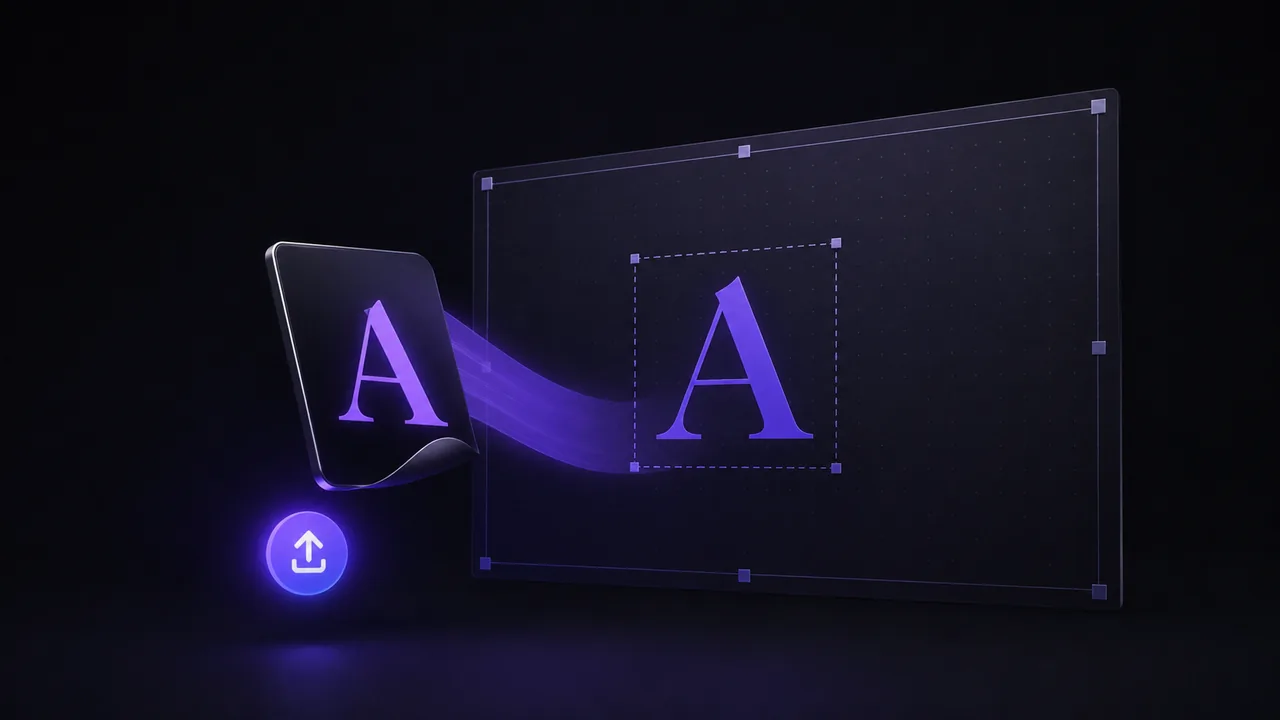
Open the tool and drag your files into the import area, or click to browse. FontMaker accepts SVG files directly, and it automatically traces your PNG and JPG images into clean vector shapes, so both work.
Each shape is placed on its matching character. If a file was not named after a letter, you can assign or rename it in a couple of clicks. You can also draw a glyph directly in the app if one is missing.
Step 3: Adjust spacing and preview
This is the step that makes a font feel finished. Type any text in the live preview and watch it render with your own letters. Then fine-tune:
- Baseline and size for each glyph, so tall and short letters line up.
- Left and right spacing (the side bearings), so words do not feel too tight or too loose.
Small, consistent adjustments here are what separate a rough font from one that looks intentional. Because the preview updates as you type, you can see the effect immediately.
Step 4: Export your TTF or OTF
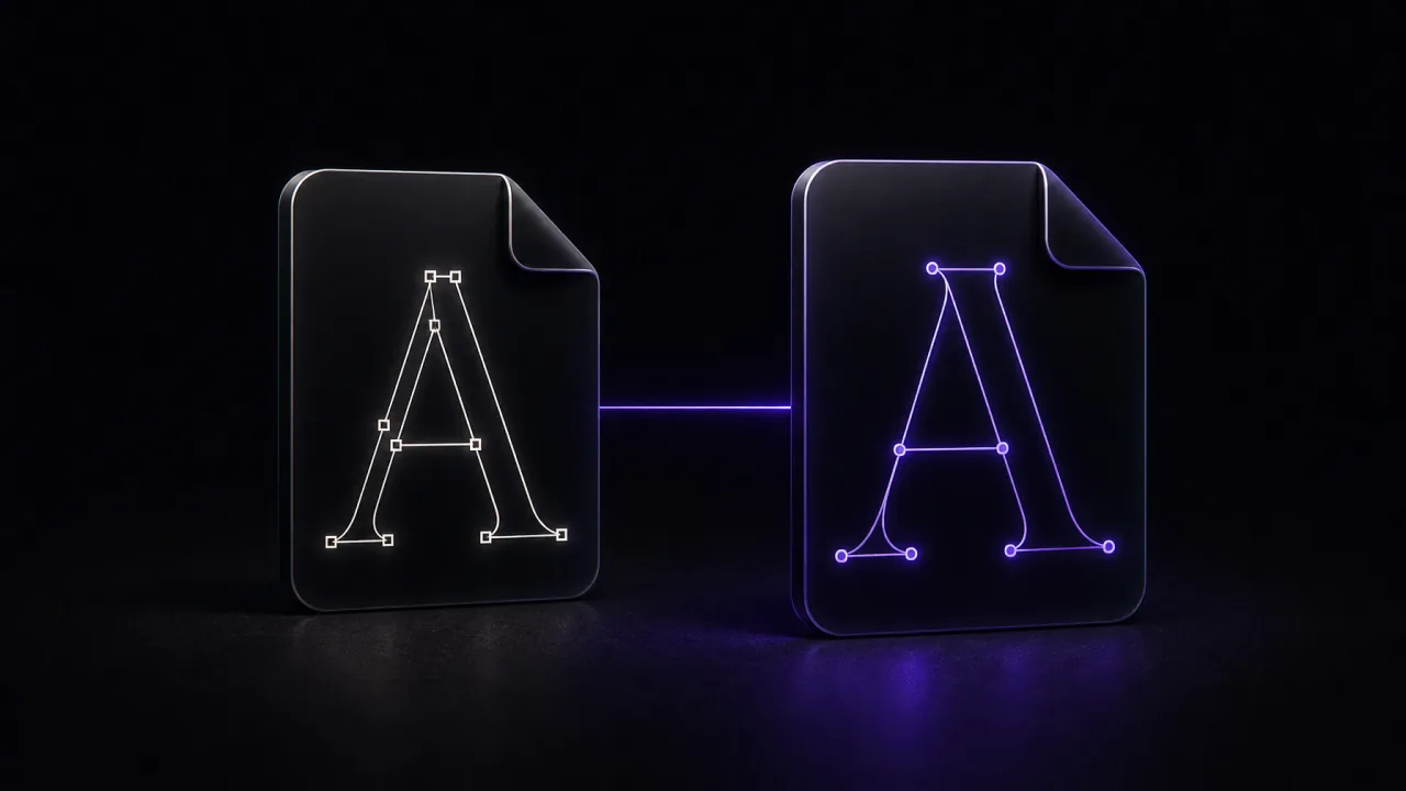
When you are happy, export. FontMaker gives you a real TTF or OTF file, the same formats professional foundries ship. That file installs on Windows, macOS and Linux, and works in any app that uses fonts: Word, Google Docs, Photoshop, Canva, Figma, and more.
To install it, double-click the file and choose Install (on Windows and Mac), then restart the app you want to use it in.
Tips for a better font
A few habits make a big difference:
- Keep a consistent style. Use the same pen, angle and size for every letter so they feel like one family.
- Mind the guides. Keep letters sitting on the same baseline and roughly the same height.
- Test real words. Type names, sentences and numbers, not just single letters, to catch spacing problems.
- Iterate. Your first export is rarely your last. Tweak, re-export, and compare.
That is the whole process. Your handwriting or your drawings, turned into a font you can type with anywhere. The best way to understand it is to try it: import a few letters, adjust, and export. In a few minutes you will have a typeface that is unmistakably yours.