You downloaded a font and got two files: one ending in .ttf, one ending in .otf. Or you are about to export your own font and the tool is asking which one you want. Same question either way, and the honest answer is shorter than most articles make it.
The short answer
Both formats work everywhere. Windows, macOS, Linux, Word, Canva, Figma, Google Docs: all of them accept both.
If you want a font that installs without fuss and never surprises anyone, choose TTF. If your font genuinely uses advanced typography (real small caps, several versions of the same letter, automatic ligatures), choose OTF.
For a first font, TTF is the safe answer. Everything below is why.
Where the two formats come from
TrueType (.ttf) was created by Apple in the late 1980s and quickly adopted by Microsoft. It became the format every system had to support, which is exactly why it is still the most compatible option today.
OpenType (.otf) arrived later, built jointly by Adobe and Microsoft. It is not a replacement so much as a wrapper: OpenType absorbed TrueType and added room for a lot more typographic information.
That history explains the confusion. An .otf file is an OpenType font, but so is a modern .ttf file in practice. The extension tells you which flavour of curve is inside, not which era it belongs to.
What is actually different
Two things, and only two really matter.
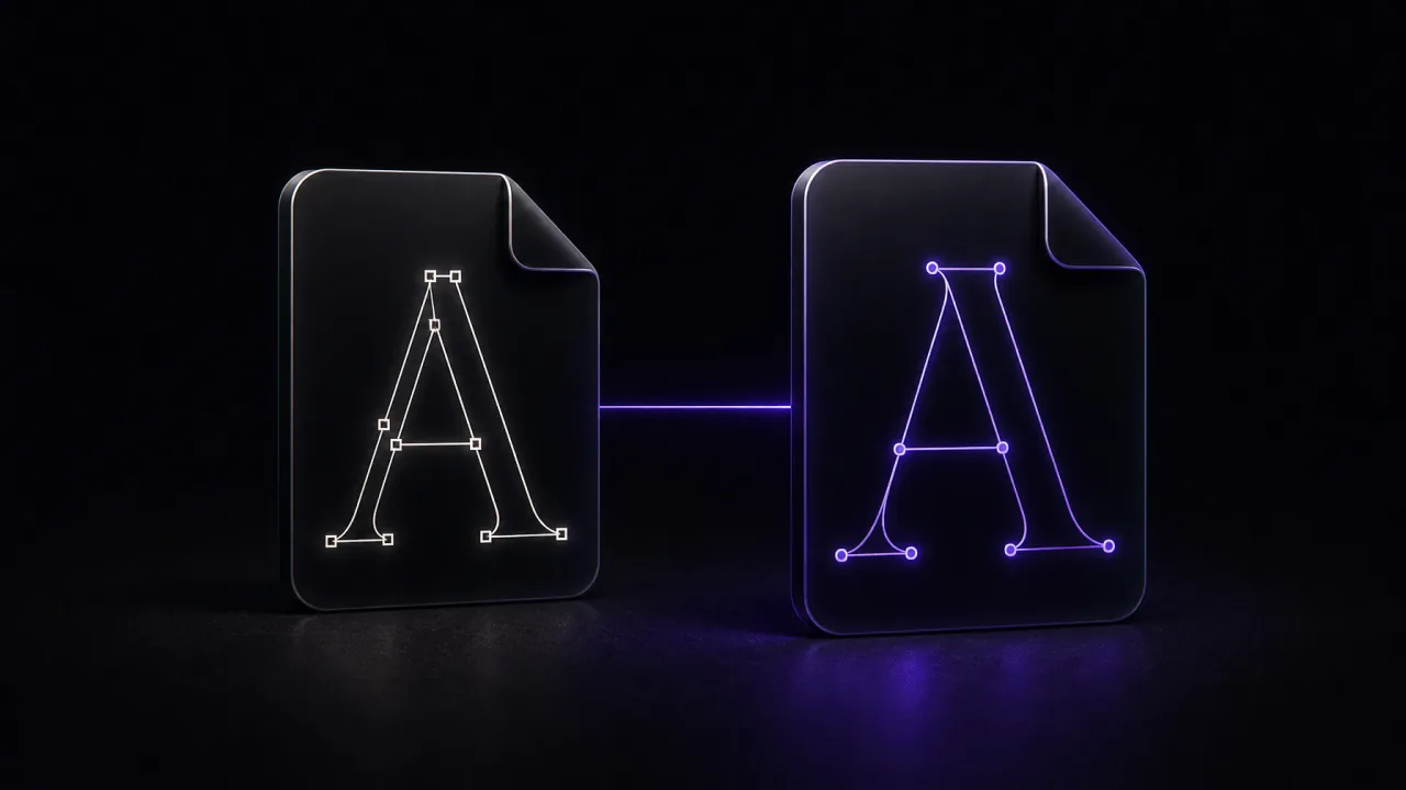
The curves. TTF stores letter outlines as quadratic curves. OTF stores them as cubic curves, the same kind you draw in Illustrator or Inkscape. Cubic curves describe a shape with fewer control points, so an OTF file for a complex font tends to be slightly smaller. On screen, at normal sizes, nobody can tell the difference.
The extras. This is the real gap. OTF has room for typographic features that TTF files usually leave out: true small capitals rather than shrunk-down capitals, old-style figures that sit below the baseline, swashes, stylistic alternates, and automatic ligatures so that "fi" becomes a single well-drawn shape.
Those features only exist if the type designer built them. An OTF file with none of them offers nothing a TTF does not.
When OTF is worth it
Pick OTF when the font is meant for design work and actually carries those extras: a serif family for a book, a display face with several versions of each letter, a script font whose letters connect properly. Professional foundries usually ship OTF for exactly this reason.
Also pick OTF if you are sending the file to a designer. It is what they expect.
When TTF is the better bet
Pick TTF when compatibility matters more than refinement:
- older software, and anything embedded in a device or a machine
- fonts for the web, where TTF is the usual starting point before conversion to WOFF2
- game engines and cutting machines, which are often picky
- your own first font, which almost certainly has one version of each letter and no ligatures
TTF is also what you want if the font will be handled by people who are not designers. It is the format nothing refuses.
Installing a TTF or an OTF
Identical, which surprises people who expect a catch.
On Windows, right-click the file and choose Install, or open it and click the Install button. See our Windows guide for the details and the per-user versus all-users choice.
On Mac, double-click the file and click Install Font in the preview window that opens. Our Mac guide covers Font Book and where the files actually land.
One rule worth remembering: do not install the TTF and the OTF version of the same font at the same time. Your apps will list the family twice, and picking the wrong one leads to spacing that quietly changes between documents.
Which one should you export
If you built a font from your handwriting or from your own drawings, it has one shape per character and no alternates. There is nothing in it that needs OpenType features. Export TTF and move on.
Export OTF if you plan to keep refining the font later in a full editor, or if someone specifically asked for it.
FontMaker gives you both, chosen at export time, and either file is a real font you can install anywhere and use in any app.